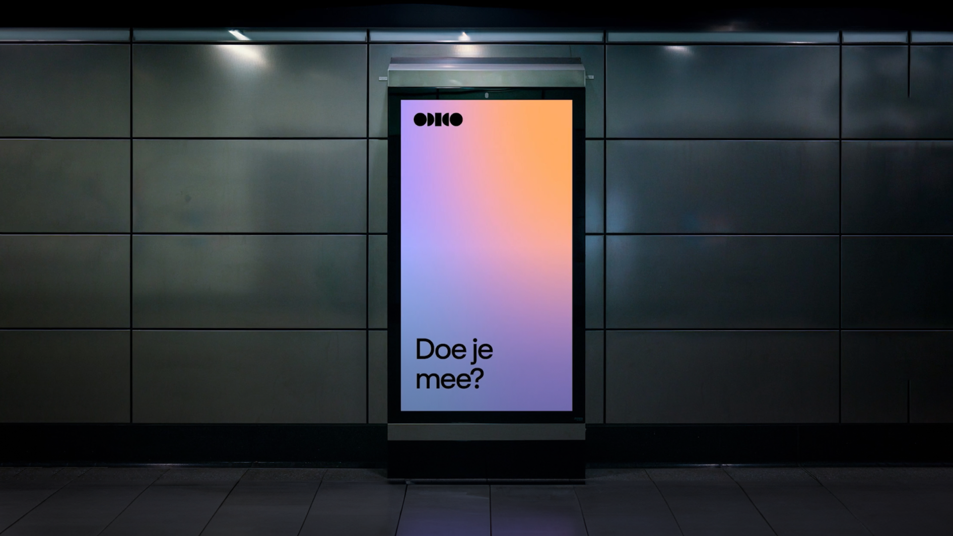
T-Mobile approached us with a compelling mission —transform our digital brand. Enter Odido.
Our journey began with deciphering their core values and translating them into guiding principles for a transformative brand experience. We meticulously sculpted a versatile, multi-platform design system that resonates with Odido’s ultimate purpose: to establish a human connection.
- 1.5YTo new brand from start to finish
- 300+Digital touchpoints launched
- 2NDLargest telecom company in NL
- 10%Cost reduction
- 4Teams involved
- 160Stores
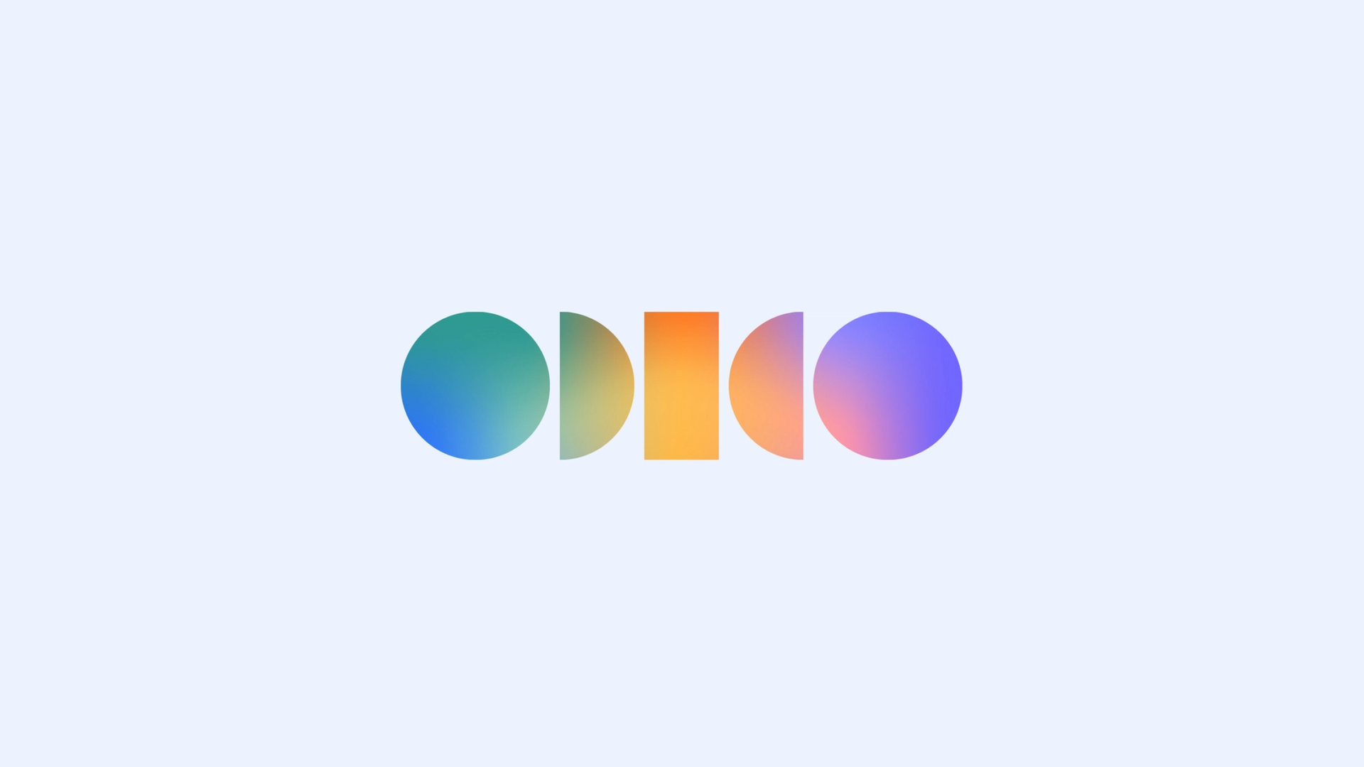
The digital brand experience for Odido
After extensive workshops, interviews, and weeks of dedicated research and design efforts, we distilled the essence of the new brand around these four core values: We serve humans, not customers.
We are always here for you.
We spark joy first.
We help you feel more secure.
These core values underpin every facet of the new brand, influencing everything from our tone of voice and design system to our choice of imagery and color palette.


A design system that is consistent, scalable, easy to implement
We took these brand values and transformed them into a versatile design system, built upon strong and easily applicable foundations. This system is not only scalable but also highly adaptable to various contexts. It leverages the brand's distinctive colors, typography, icons, and shapes to evoke a profound sense of security and reliability.
Throughout our design system, you'll find the unmistakable 'bubble' shape, serving as a unifying element. When infused with motion, it subtly alludes to Odido's central product: facilitating human connection through seamless communication.

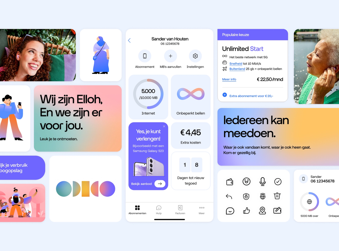
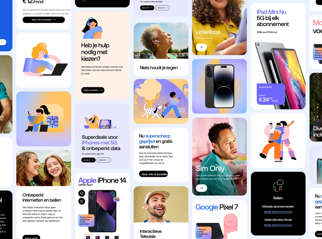
A unified language across every touchpoint
Our task was to establish the digital design foundation for Odido. To accomplish this, we carefully crafted a design system that prioritizes consistency, scalability, and ease of implementation. This versatile system enables us to create content for a wide range of platforms, from emails and television to billboards, apps, and websites, all while maintaining a unified visual identity across every touchpoint.
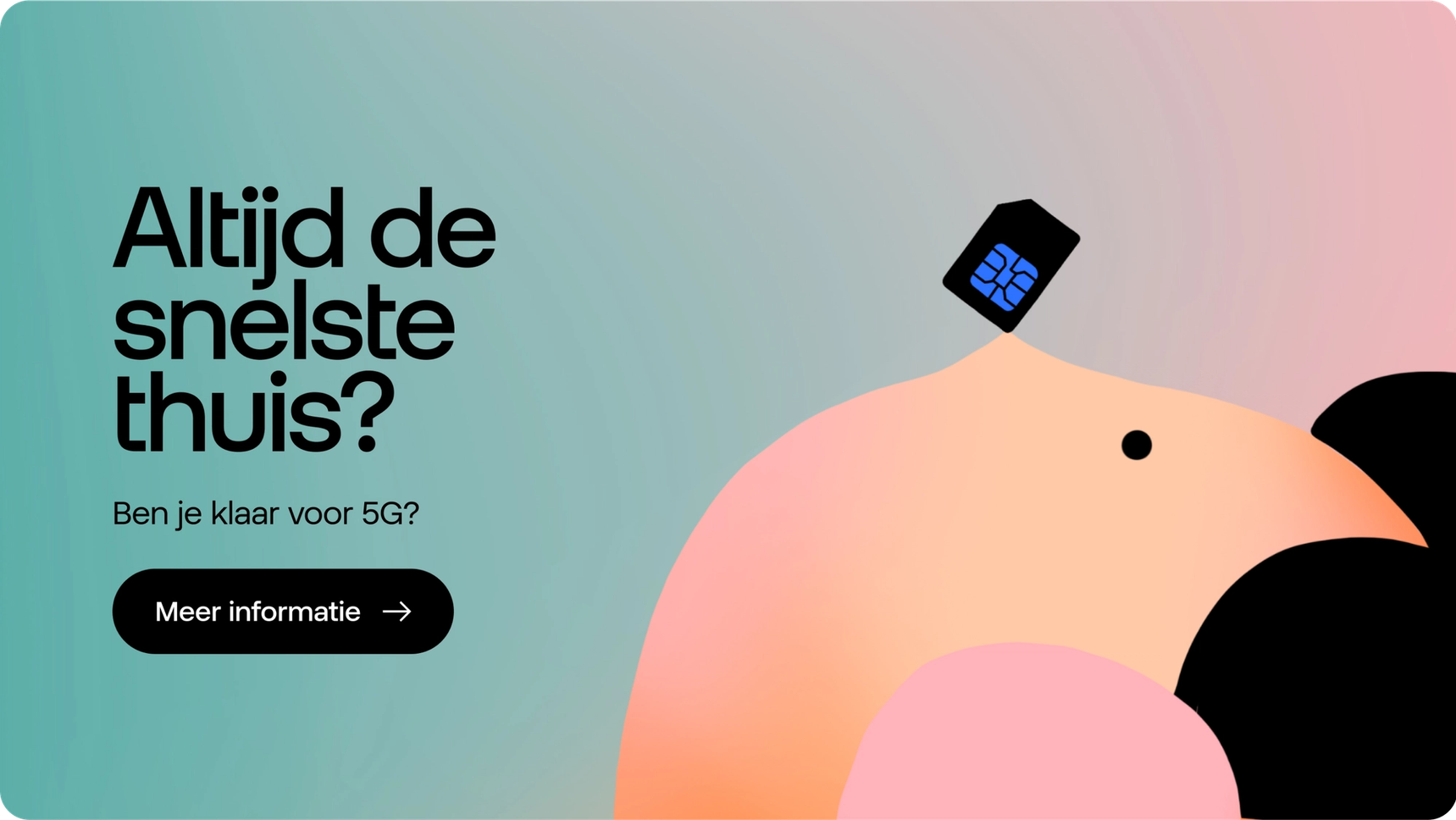
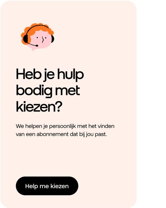


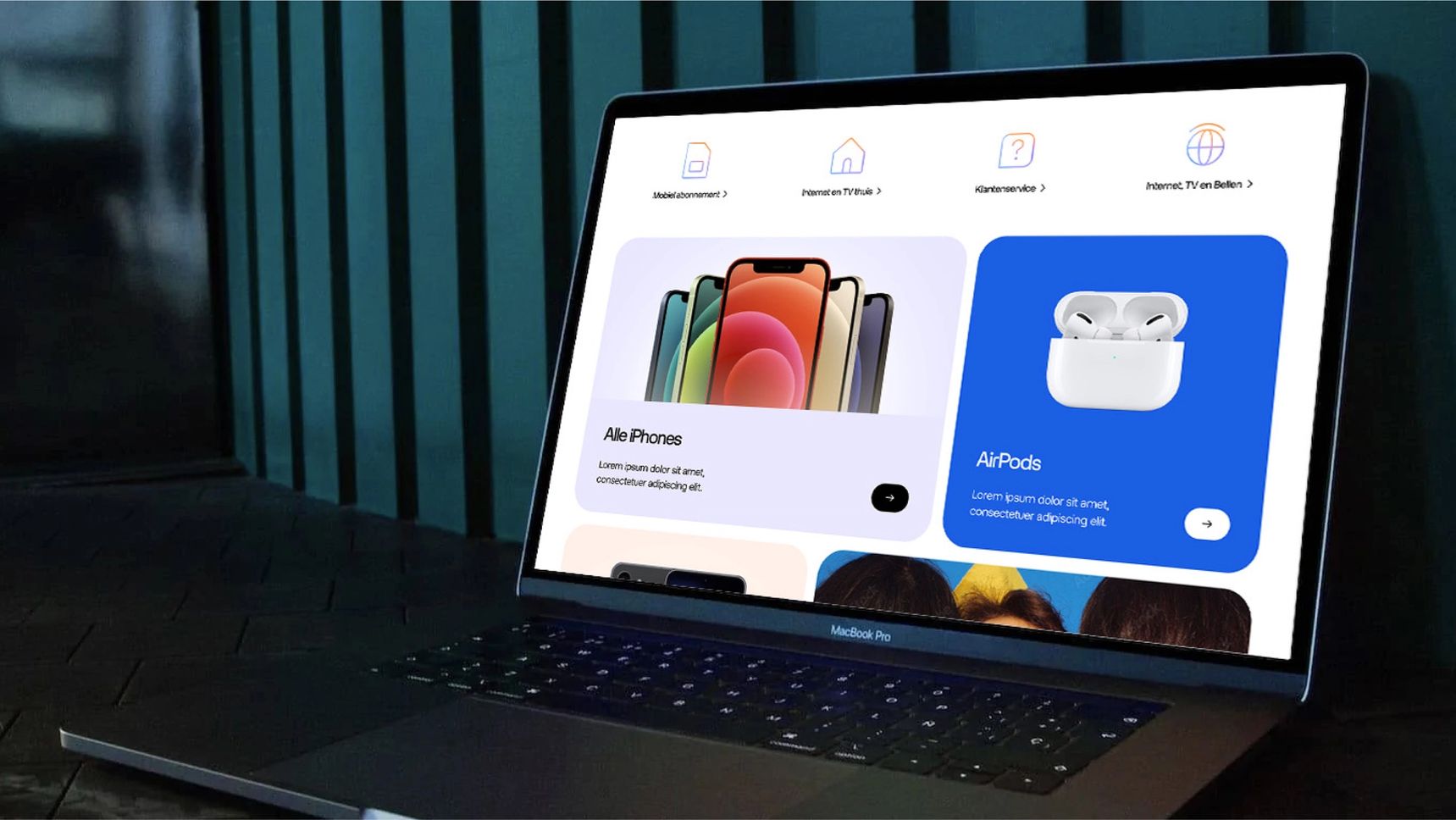
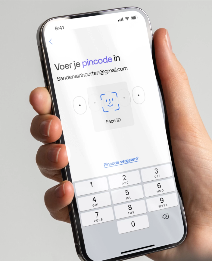

Our design system features custom-made icons, as well as custom typography which was developed from scratch, and a seamlessly integrated motion system. Additionally, we've incorporated basic accessibility practices, all with the aim of making technology more accessible and human-centric.
Motion design as a key driver for a the new brand
As we navigated the brand elements it became apparent that we needed to define their role within the digital landscape. Chief among these was the Glow. We wanted these roles to be meaningful. For the Glow: this meant giving it a specific portfolio of work. It’s job title: ‘The glue that holds the experience together’.
- Delivering content (content comes from the Glow)
- Supporting interactions (the Glow gives feedback in interactions)
- The Glow is the foundation (underneath everything else there is the Glow)
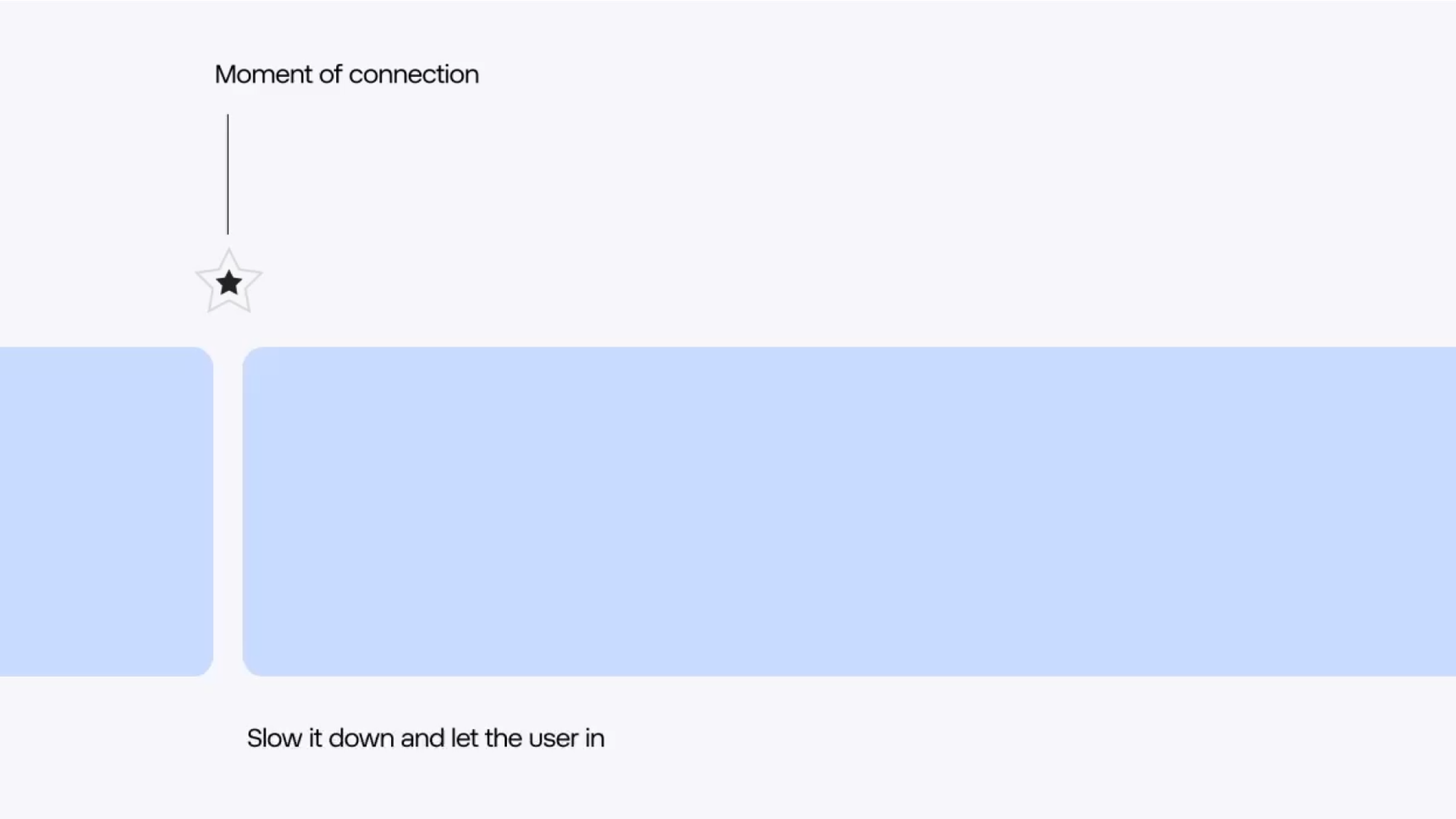
As we navigated the brand elements it became apparent that we needed to define their role within the digital landscape. Chief among these was the Glow. We wanted these roles to be meaningful. For the Glow: this meant giving it a specific portfolio of work. It’s job title: ‘The glue that holds the experience together’.
Solid change starts here
Contact us and let's get started.
