Normalising the use of microbial elements in food and encouraging innovation
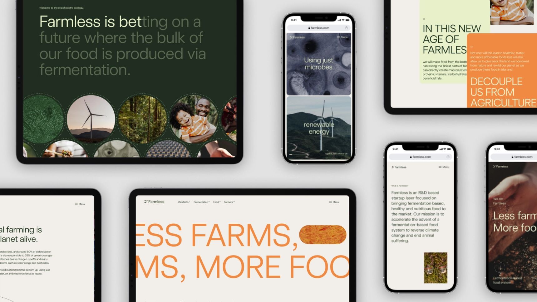
Farmless is an R&D-based startup focused on bringing fermentation-based, healthy and nutritious food to the market using microbes. They came to us for a website targeted towards investors, partners and scientists who are wanting to get involved in the early stages of this company, thus the challenge was for us to create a site that was informative and trustworthy, while being exciting and innovative.
Creating a world with more nature, but fewer farms
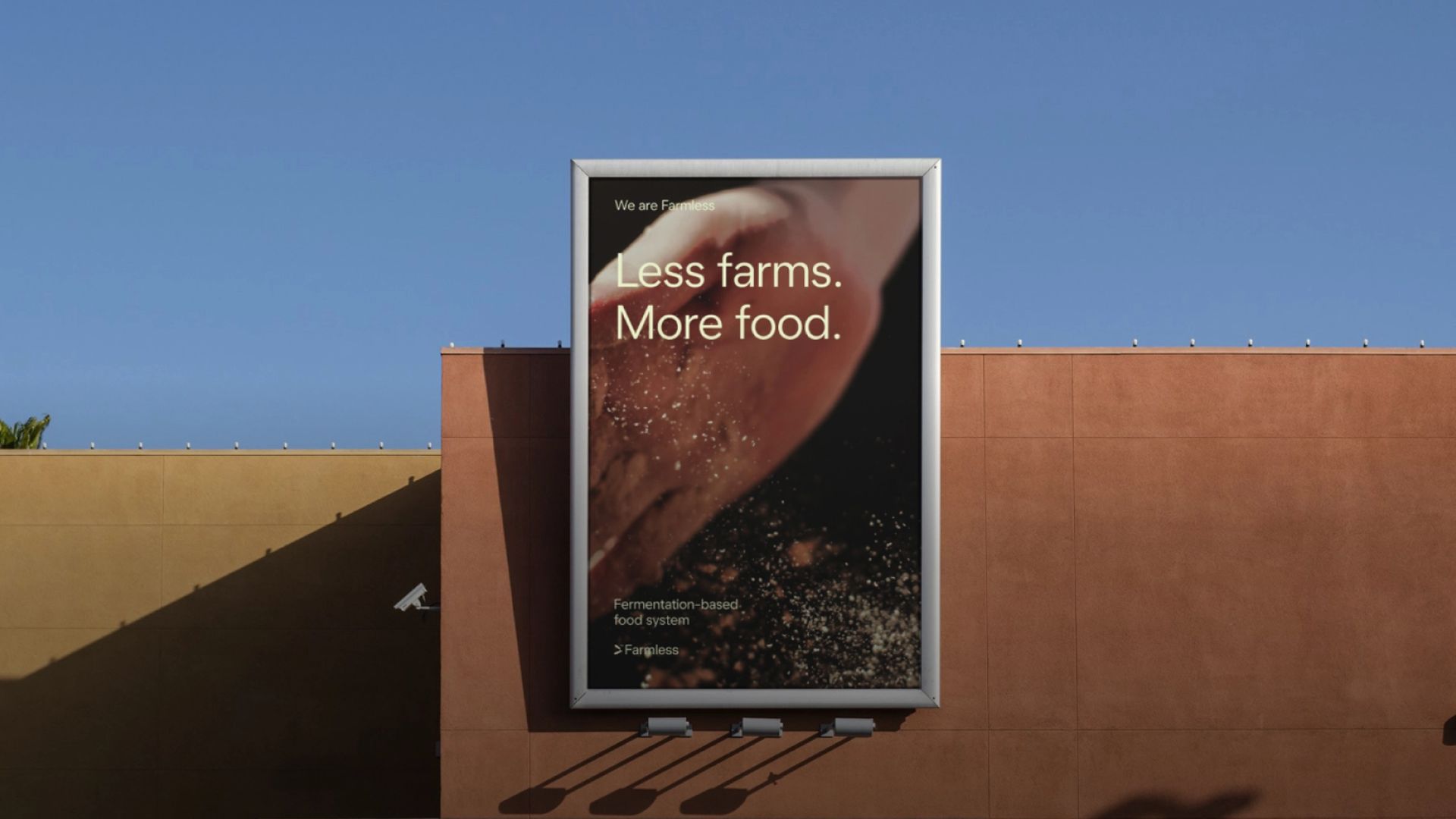
Farmless’s expert team is driven by a mission to accelerate the advent of a fermentation-based food system to rewild the planet and end animal suffering.
What makes their approach unique is that they are fermenting nutritious and sustainable microbial protein decoupled from agriculture. There is meticulous scientific and technological work, using renewable methanol as a feedstock for fermentation in large scale off-the-shelf bioreactors. Creating a future where food production is freed from animals and agricultural land; a world with more nature, but fewer farms.
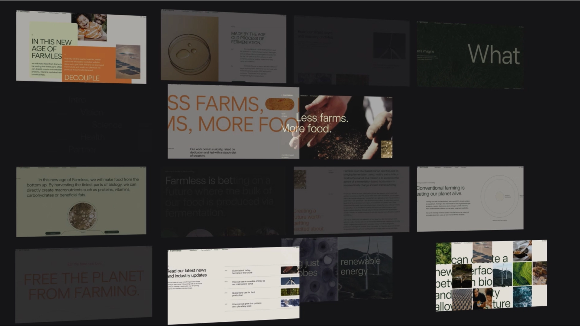
Familiarising the science
Farmless is bringing a new and exciting product to the table and so we wanted to approach the branding in a way that would mimic these emotive feelings and allow the target audience to get just as excited about the product as the owner himself.
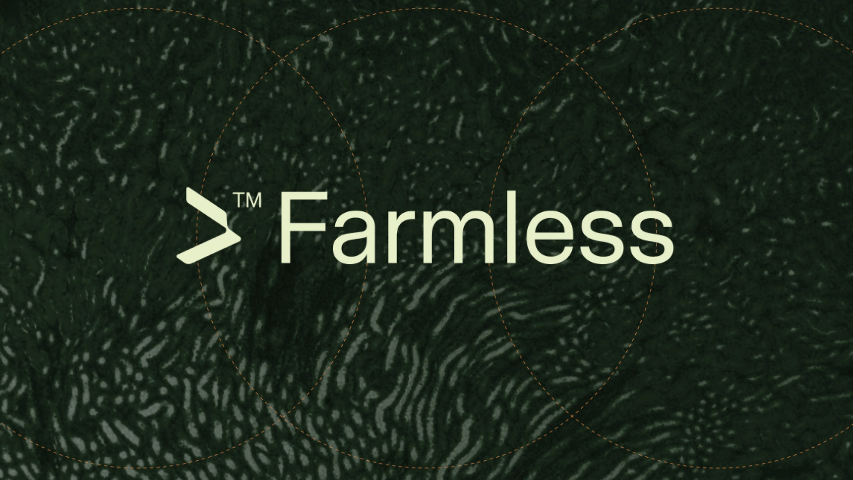
The branding phase emphasised on visualising the science and technology behind Farmless, keeping in mind a mission to educate and normalise the use of microbial elements in food production and encourage innovation for human eating and living sources. As the microbe is the core of Farmless’ approach, the design visually expresses the microbe by connecting it to its natural form and the planet. The logo connects with bacteria being a source of life and a fascinating organism in its essence. Hence, every element in the branding of Farmless is curated in a style that connects with the planet in its smallest and most massive forms.
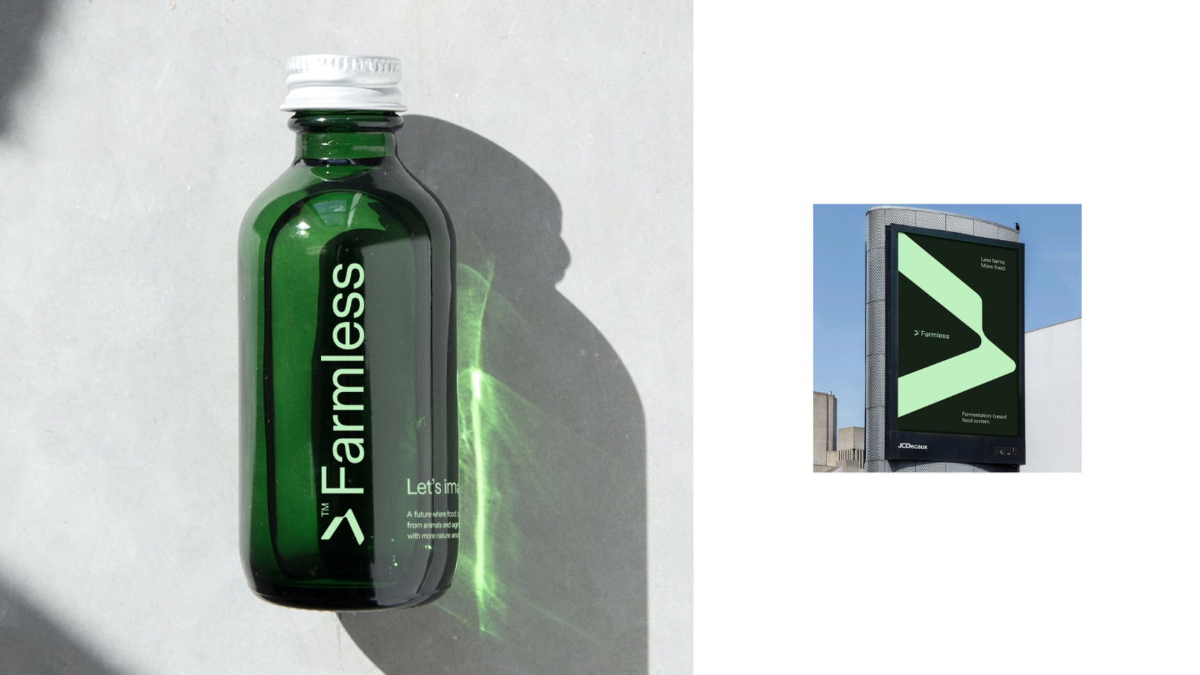
Complex science in a few bite-sized pieces
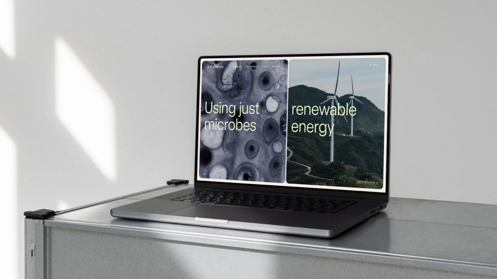
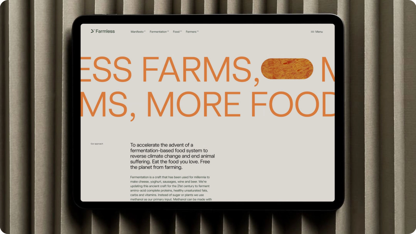
The approach for the homepage was to use a horizontal scroll to indicate from the get-go that Farmless and their product are not conforming to the regular rules. The homepage offers a storytelling-like journey for the user, breaking down the information a little bit more with each scroll. This digestible way of informing the user is successful in both getting directly to the point of the Farmless goal and creating anticipation. After this short intro, the users are then directed to the rest of the website where we have stripped back the animations and allowed for the information to be the focus.
Leaning on the branding to guide the UI, we had a clean and simple aesthetic for Farmless to match with the scientific aspect of the company. However by adding lovely pops of bright green and orange we again reinforce the idea that this is not another typical product. Falling under multiple umbrellas; science, agriculture, food, environmentalism and technology, we wanted to ensure that all areas were able to shine individually while being able to position Farmless uniquely as a combination of all of these aspects.
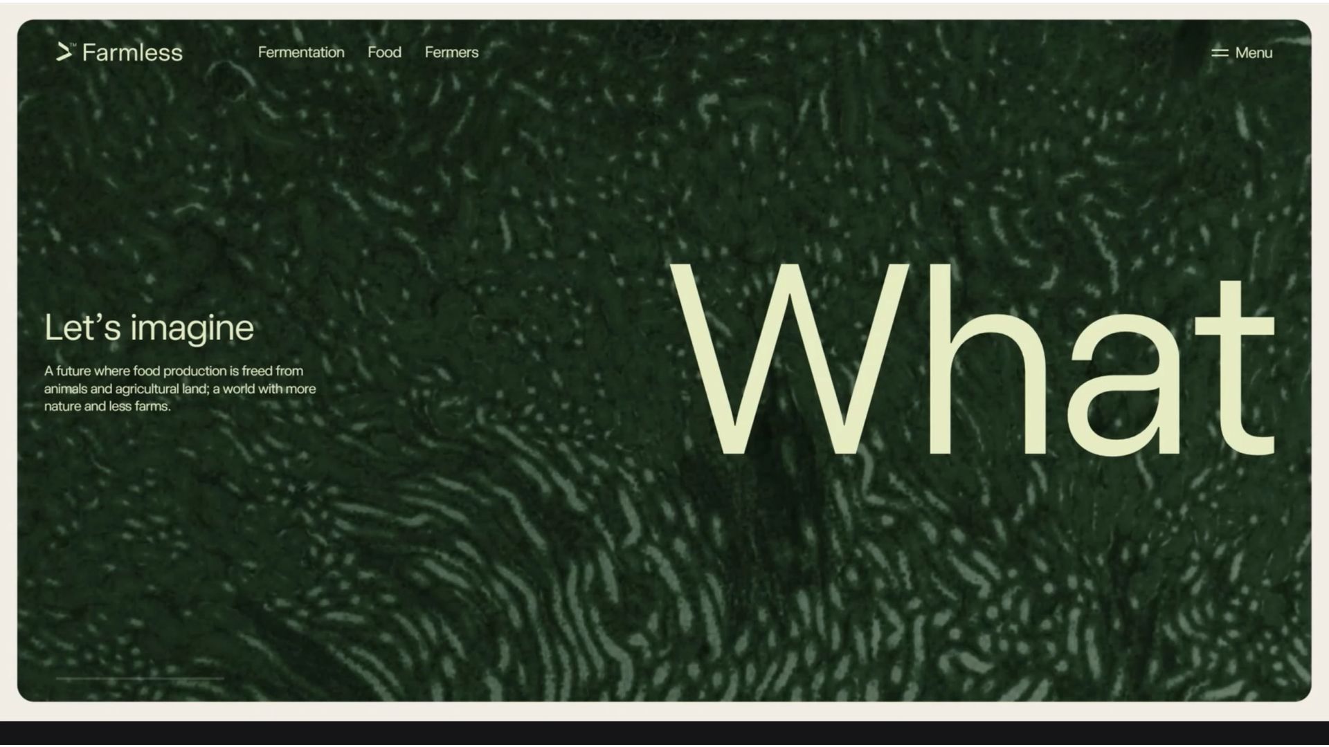
Together with Farmless, we have achieved a new brand that tells a story, educates visitors, and maintains visual creativity. The brand has come to life to invite partners, investors and experts in the tech industry to join the cause. Farmless has been featured in Techcrunch and has raised a €1.2 million pre-seed equity round at an undisclosed valuation to bring to our tables proteins created without the need for traditional farming operations. With the website now live we want to thank Farmless team for the great collaboration.
