
Joshua Noon
Motion Design Lead
26 Sep 2023, 12 min

Joshua Noon
Motion Design Lead
26 Sep 2023, 12 min
Step 1
Only 1 in 5 organizations uses brand as the basis for experience. How can an active brand definition help break that trend?
When we were asked to undertake the digital roll out of the Odido brand, motion was absent from the identity. This gave us the opening (and not inconsiderable challenge) to think about how this brand would move from a holistic perspective. We knew from experience that taking a digital-only view would lead to a fragmented landscape, and there wouldn’t be enough narrative to push the work into interesting places. We needed an idea that could underpin motion across the entire brand ecosystem. We needed meaning. The idea needed to be an expression of the brand core: ‘To be more human’ and deliver on the design principles:*
* We focussed on just these three principles that were able to be realised in motion.
The new brand identity gave us the following core assets to work with:
Logo
Typeface

The Glow (a series of gradients)
The Glow represents the joy of being connected with others. It’s a visual manifestation of this human emotion. So we started there. This led to the following questions:
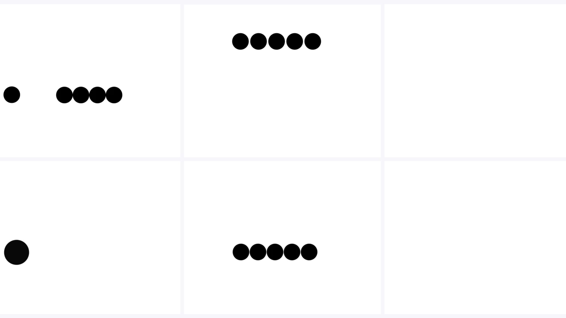
Early experiments: What does connection look like in motion?

After exploring these questions an idea emerged. The Glow is a cloud. Inside are millions of balls of … er … glow. These balls were constantly colliding with one another, transferring energy (connections). When viewed from outside — you see a glow.
This felt exciting we had; Connections, we had Energy, and by extension something Playful. However this ‘cloud’ would make a challenging space in which to interact. There was nothing to stop the connections, and at some point things need to come to a rest. To solve this we introduced a second element: Water.
The idea was to imagine this energy suddenly trapped in a viscous fluid. It would dissipate gracefully and cascade in the form of waves. We called this idea ‘Pop and Flow’ (internal names make great sense until you write an article). This last element ‘the flow’ felt welcoming and participatory, finally we had Warm too.
From this core concept, we were able to keep iterating different expressions from one common root. Be they above-the-line or digital, and ensure that everything felt like it was coming from the same Odido world.

Energy from connections informs our motion.

Within UI Physical connections, can play out within an element, or between separate elements.

The logo animation is a direct translation of energy meets fluid. The effect is welcoming — like throwing open the doors.
Step 2
As we navigated the brand elements it became apparent that we needed to define their role within the digital landscape. Chief among these was the Glow. We wanted these roles to be meaningful. For the Glow: this meant giving it a specific portfolio of work. It’s job title: ‘The glue that holds the experience together’.
Its responsibilities (our rules):
This gave meaning to how we thought of this core element and gave rise to distinct ideas:
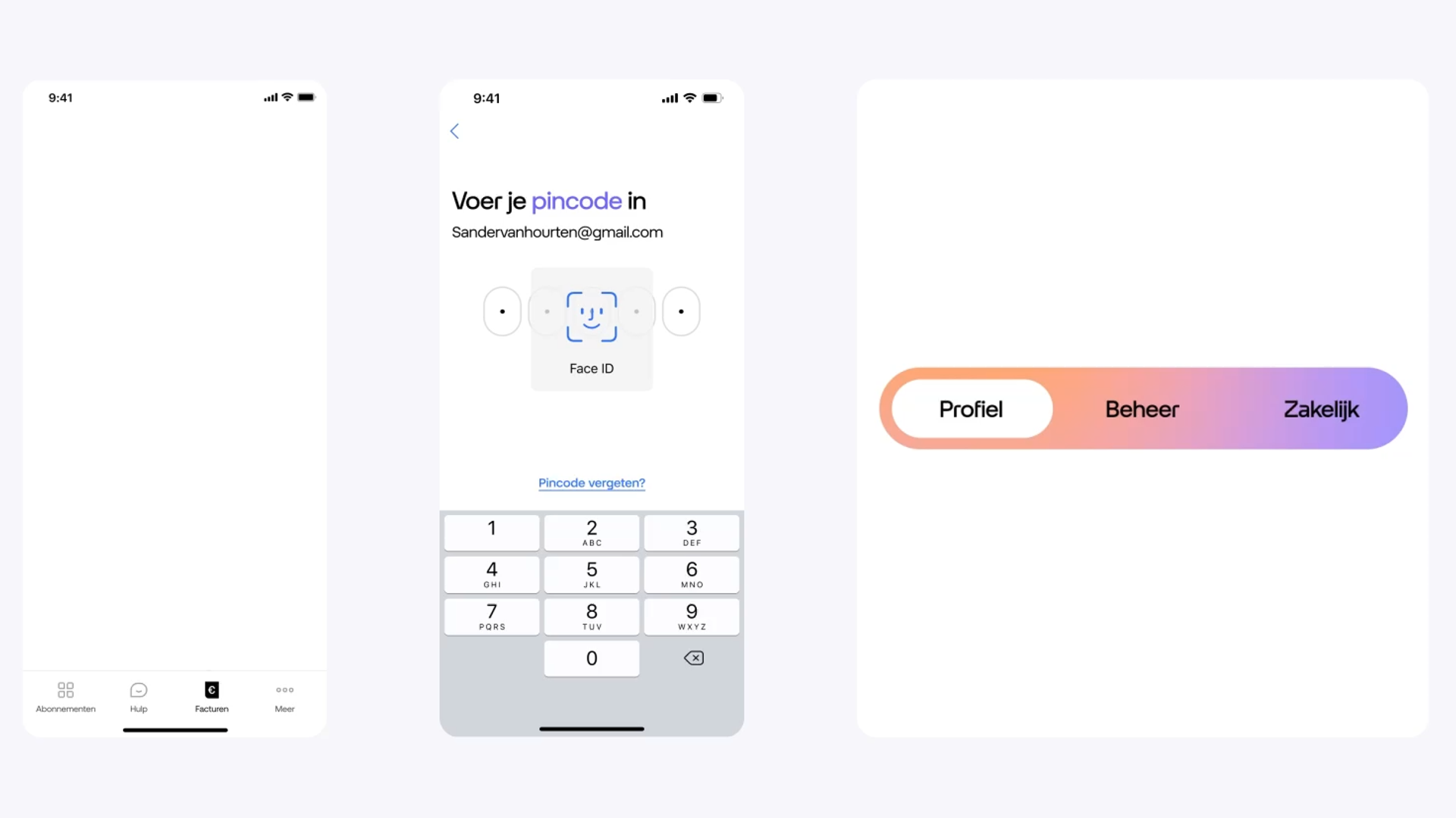
Left to right: Glow as loader, Glow as foundation, Glow supporting interactions.
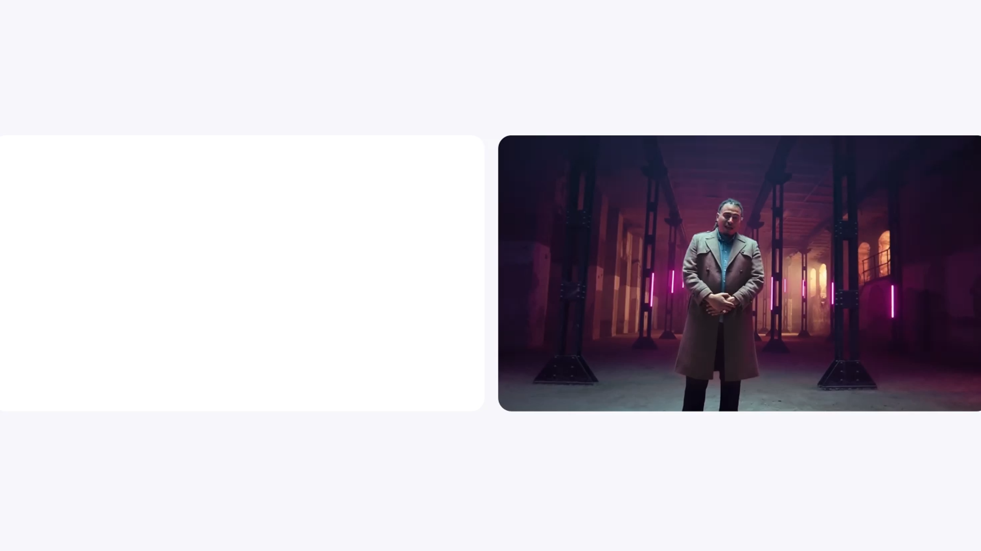
Idents: Content comes from the Glow
Step 3
Due to the size of the project, we needed to think in an ecosystem context. We did not have the luxury of investing in a few key components or rebuilding components from scratch to accommodate motion. If we had pursued this, most of the experience would be left static.
We decided to focus on reusable behaviours that could inform multiple components and give the experience life at scale. Once implemented, elements given these behaviours would be disseminated across the ecosystem, bringing touches off life at myriad touch points.
These behaviours were:
This gave meaning to how we thought of this core element and gave rise to distinct ideas:
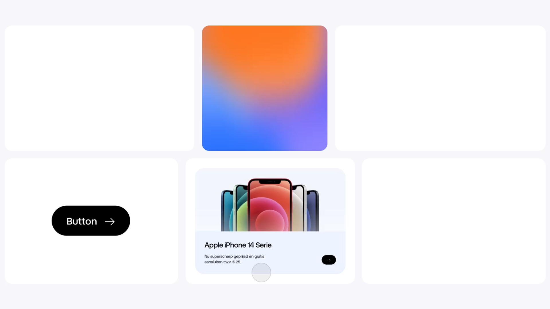
Core behaviours, Left from right: Directional Typography, The Glow, Speech Bubble, Sliding Button, and the Logo.
As we invested in defining brand behaviours rather than components, one behaviour could lead to the motion of multiple components:

One behaviour multiple components, Left to right: Speech Bubble, Tool Tip, Sticker, Shopping Cart.
This approach also made the best of our limited development resources and ensured the motion was used with purpose, conveying information and personality as the user engaged.
Step 4
At Hypersolid we strongly feel that motion should be used with purpose. If there is no value added by motion don’t do it. Furthermore the role motion plays (value it can add) changes at different moments within the experience. As we created these motion behaviours it was important that we make these nuances explicit.
To these ends we created a usage triangle that gave three ‘purposes’ for motion beyond conveying essential information: Elevate, Enrich and Finesse. These purposes have a proportional relationship to the extent to which they are used. In general the more the dramatic the motion the more limited its usage.
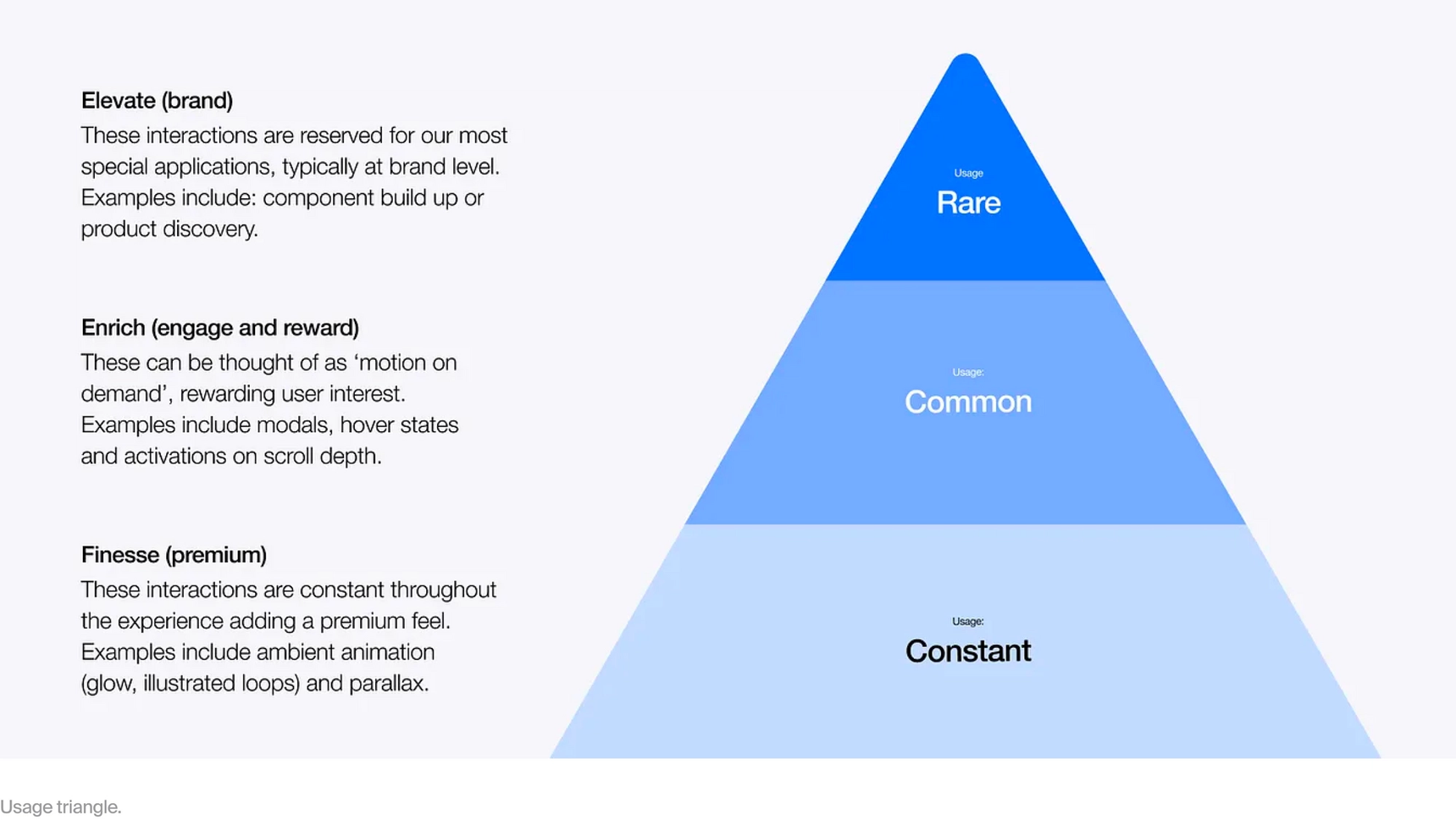
How it works in practice
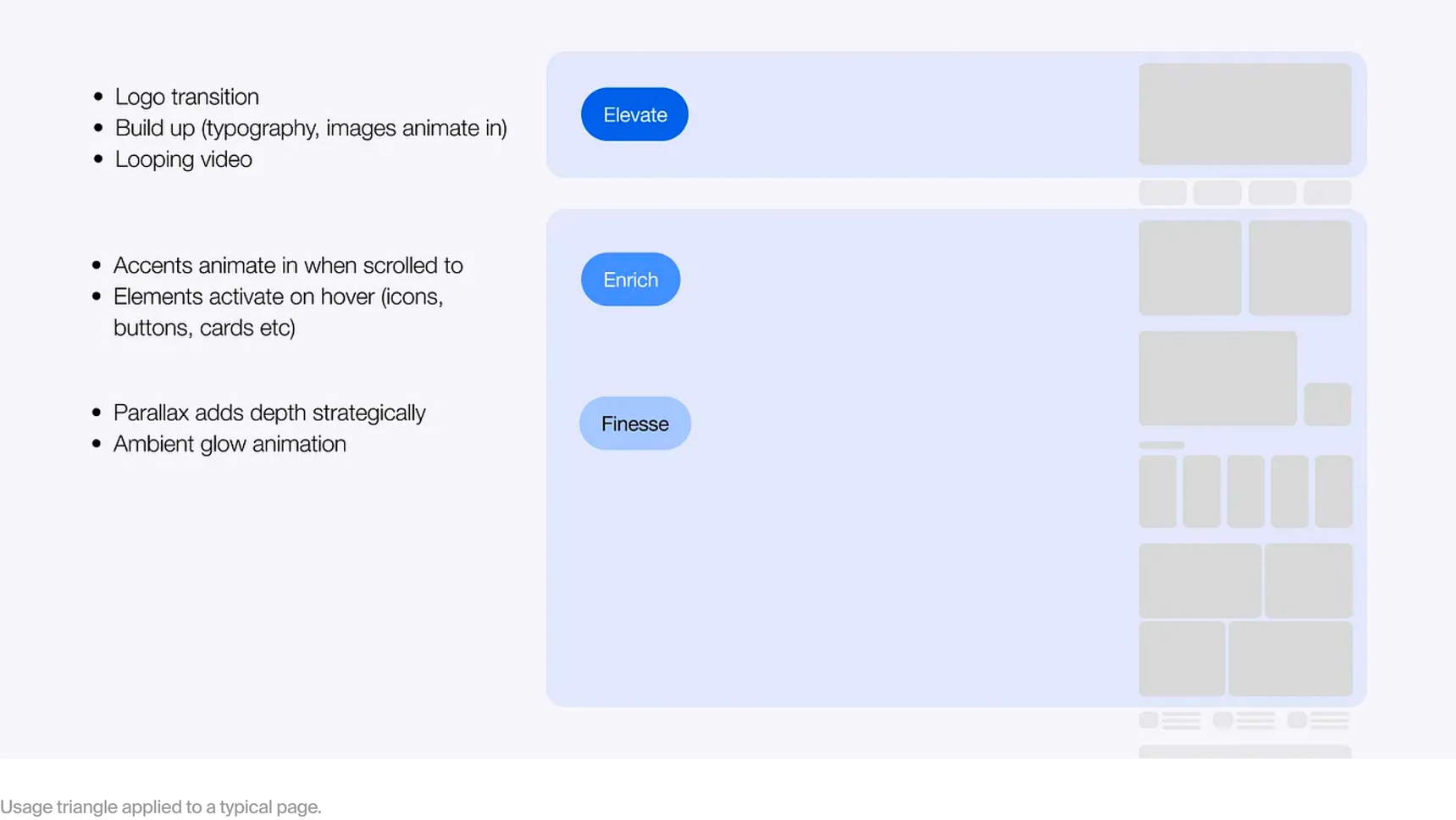
Having this in place made decisions much easier. We could make a decision like: We only use build-ups* in the first component on the page — because here we want to make a strong first impression (Elevate). It also served as useful documentation for the client, as they could see the ‘why’ of each layer of motion and think along strategically.
* A build-up is where each element is individually animated on to the screen in a choreographed way
Step 5
And lastly a plug for the digital side of things — design for motion. Creating motion for digital can feel limited. Much of the design work across this project consisted of restyling sections conceived without motion in mind. In many cases this meant there was only so much we could do. And adhering to the ethos that motion should have a purpose, not much we should do.
However, we had the opportunity to deliver a vision that showed what the experience could look like if such constraints were ignored. Miraculously, much of this was built. Here we had synergy between design, motion and dev. The resulting sections were naturally richer, and motion directly enhanced the message of the section. For me this clarified how purpose is your guide when using motion. When the opportunity is not there, don’t overdo it, let function be functional. And when motion delivers meaning, let loose.
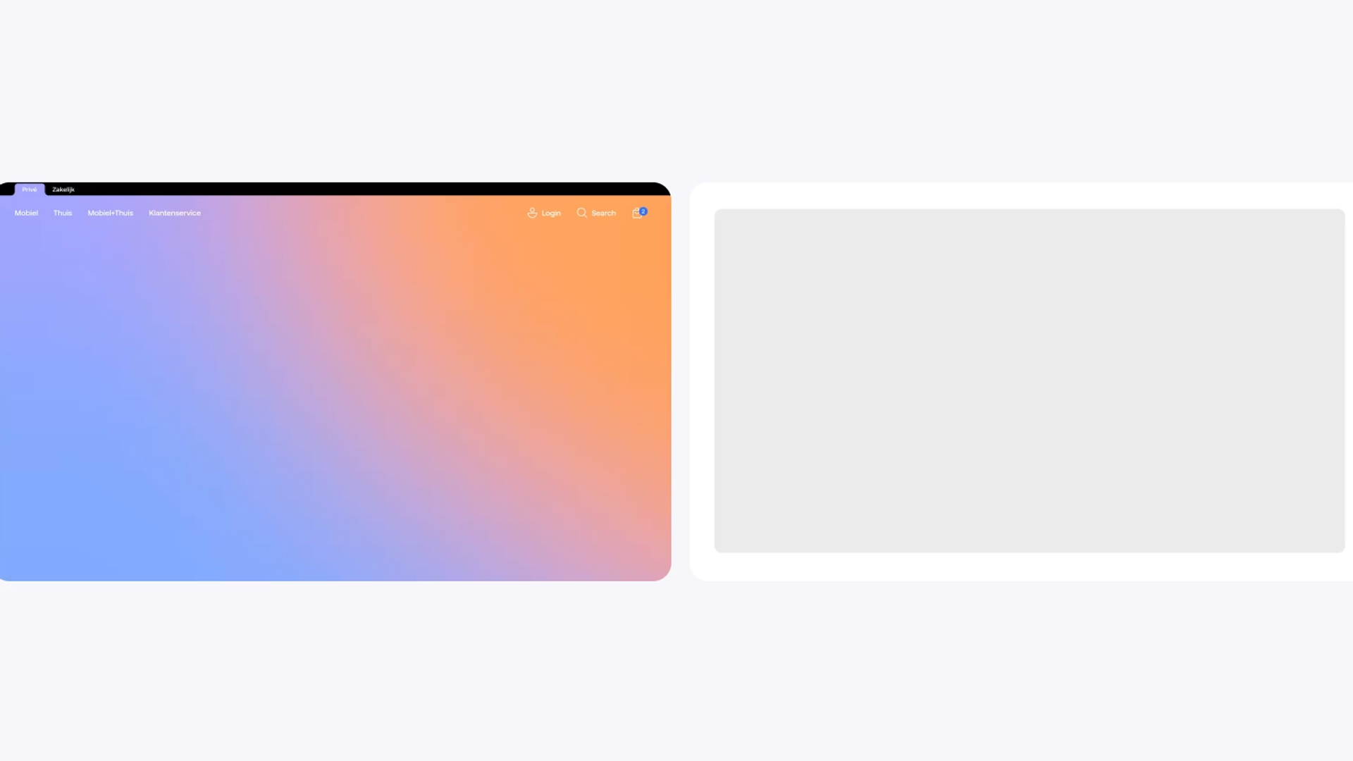
Sections designed for motion: Hero, Unlimited plans.
Start with meaning, and keep making meaning; whether that’s creating jobs for assets or defining when, where or how to use something. Doing this with motion takes a brand to another level — and is a lot of fun. We often say motion ‘brings it to life’. I believe what we mean is: ‘Brings it into our world’. For a brief moment the brand is alive, a part of our time based reality. To me this is when the magic starts, this is when an experience becomes memorable. This is when we feel something. To do this convincingly, both digital and above-the-line motion need to draw from the same ideas. In a nutshell; The brand we bring into our world, needs to feel like one world.
Interested in the end result? Check out our case. Or simply click over to Odido.nl.
Special thanks to my co-conspirators in this journey: Rob Wienk and Rob Stroom. For guidance along the way: Vincent Venema and Jose Sebastion. And to the Odido team whose enthusiasm and commitment made this work possible.
Perspectives
Industry insights, company updates, and groundbreaking achievements. Stories that drive Hypersolid forward.