In today’s hyperconnected world it is critical for a brand to be extremely flexible but recognisable, yet consistent and flawless at the same time. Getting this right will inevitably result in happy customers, more business, improved competitive advantage and a longer lunch break for your customer service call centre agents.
That’s the job of a design system: to find the right balance between freedom and strict rules and making it super easy to design, develop and maintain products for the brand. But while this is complex enough to design from scratch, in December last year we were tasked with the ultimate challenge: Odido.
Odido (at the time still highly secret) is a completely new telco brand that would arise out of the merger of T-Mobile and Tele2 in the Netherlands. Two massive A-brands, both with legacy design systems in place, with over 150 touchpoints including web, app and TV and over 7 million users. The challenge was to merge these two brands into one design system, a massive amount of motion and zero actual customers to test on. Here’s how we did it.
Why you should use a design system
You probably know what a design system is all about. If not, here’s a summary: a design system is like a set of tools that helps people who create content, design, and build things to work together better. It makes everything more organised and faster. Imagine a scale between strict rules and total freedom in how you use it — that’s where a design system lives. It’s important to find the right balance depending on your company’s goals and culture.
T-Mobile and Tele2 already had a design system, for multiple brands — a multilabel system; it facilitates everything mentioned above for the different brands under their umbrella and covers web, app, and TV experiences. Using an existing design system in a big rebranding project has lots of benefits:
- Quick updates: With a design system in place, changing things in a centralised place happens across lots of other places much faster.
- Easy communication: Design tokens help designers and developers communicate and synchronise changes.
- Steady and flexible: Having a proper architecture with a core library containing foundations and components in the design system is a strong base, this is easily scalable across different domains (in this article referred to as “touchpoints”).
- Working together: The design system helps different teams work as one, even when working from different places.
Figuring out the details
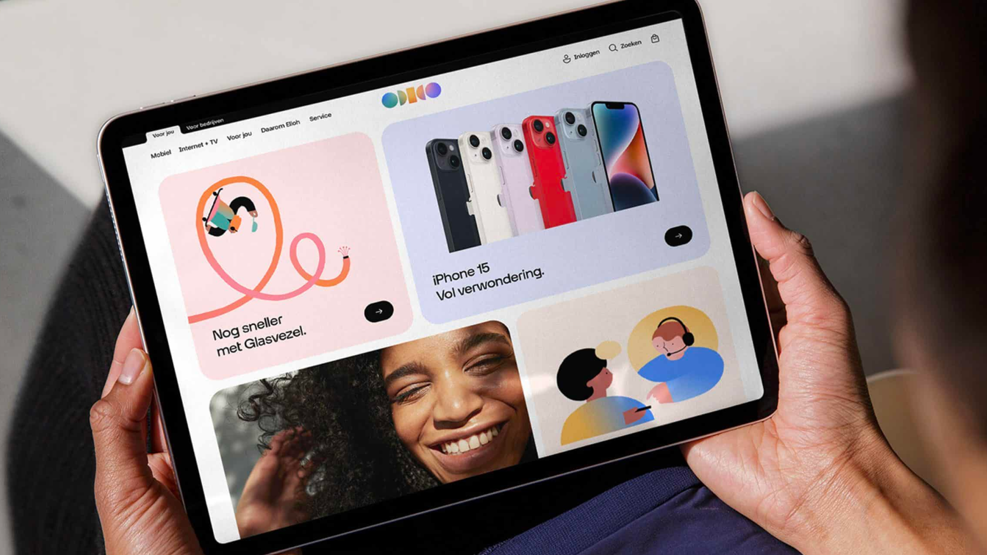
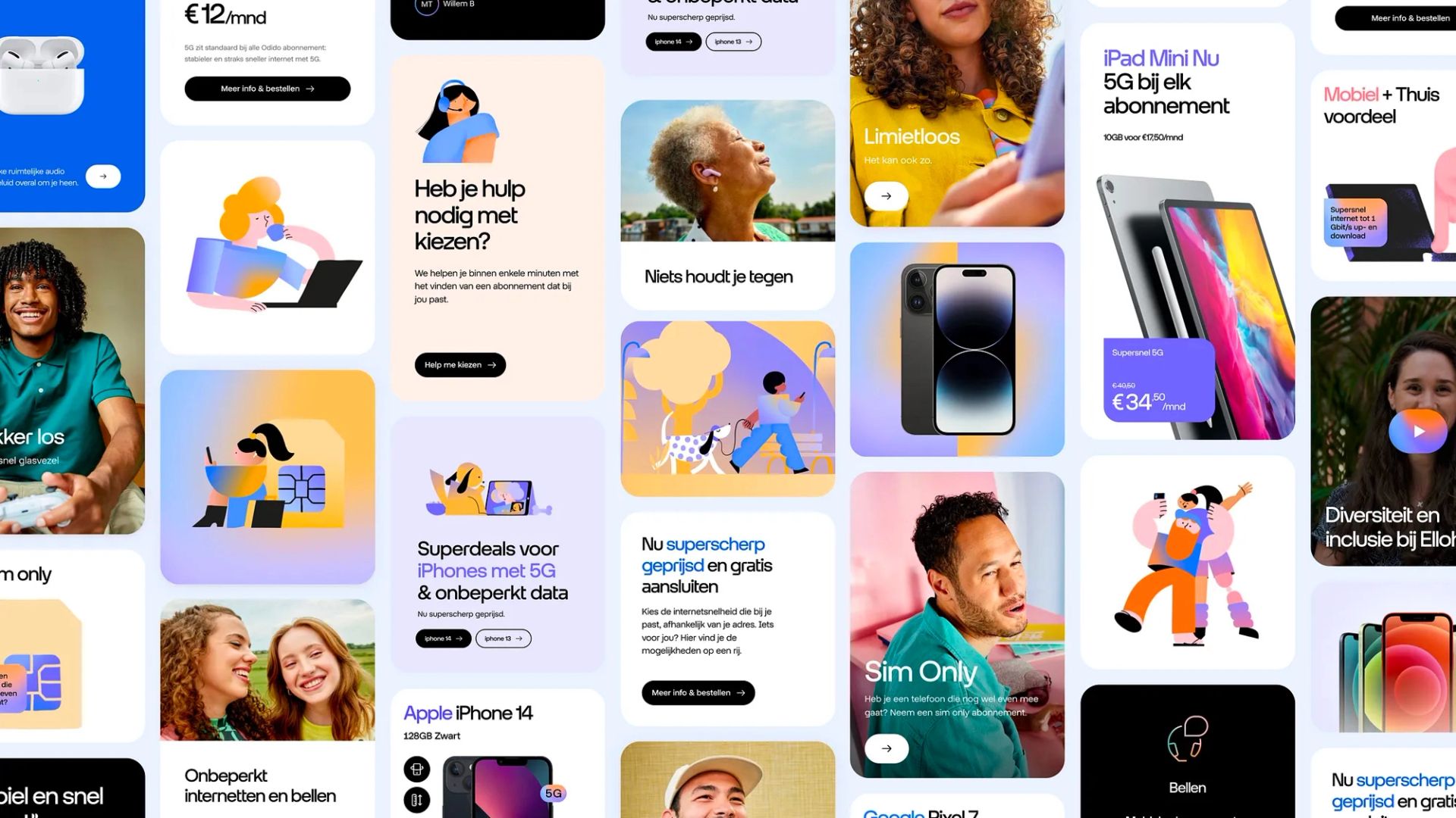
With the new brand, nearly everything changed — its logo, colours, fonts, and much more. The bigger part of the flows and content stayed the same, but the visual perception had to change. To accommodate the new purpose of the brand, some new components had to be created too, based on the new ideas.
We introduced a lot of motion to fit the brand and to make it stand out in the field. This also meant the way things worked for these components had to be updated. The cool thing about a design system is that you can quickly test these changes within an existing context. It’s very similar to trying on new clothes and seeing if they fit well.
Dealing with challenges
Projects like this obviously come with their own challenges. At the start, we created a design system canvas to understand the true needs, challenges and success criteria within this project. Next we conducted a design system audit to understand the existing design system and found a few obstacles: potentially breaking the other labels connected to the system, manually changing legacy design decisions into new ones, synchronising changes with development, not all 150+ touchpoints being connected, and the scalability of the system.
We came up with two ideas to solve these issues: use the current system (version A) and upgrade it, or create a totally new one (version B). The first option was assumed to be faster initially, but we were pretty sure that we needed some options from version B to make the system more scalable (version A+). The curve of version A+ shows that it meant some investment made us slower initially but we expected to speed up with this approach, so that’s what we went for.
It starts fast but experiences slowdown due to legacy issues

Initial slowdown is expected, but significant speed improvement is anticipated due to the scalability of the new system.

Initial small slowdown due to investment, followed by improved speed as the system adapts to rebranding.

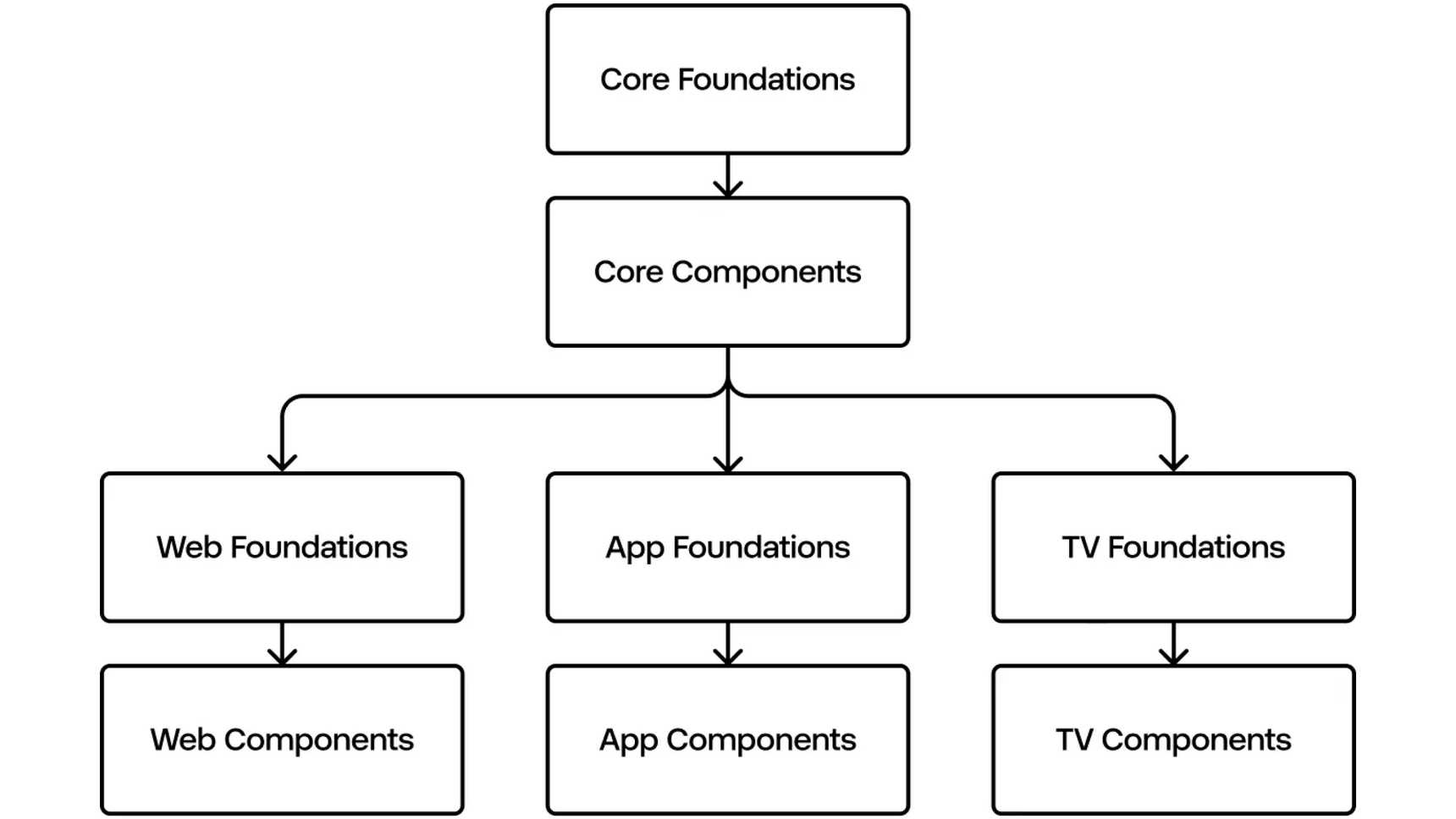
There was a risk of duplication and misalignment due to separate design system libraries for each application. We created a core library to move all reusable foundations (e.g. colours and fonts) and components (e.g. buttons and links). For the specific foundations (e.g. a web grid) and components (e.g. an app bottom-bar) per application we used the domain-specific libraries for web and app. This scalable setup makes it really easy to add a new application later on that can consume the reusable foundations and components from the core library.
There was one vital challenge: prioritising accessibility right from the start. Our strategy involved embedding basic accessibility practices from the beginning of the project. By setting the foundations at the core level and having our designers seamlessly integrated accessibility without added complexity or singling out individuals.
The following challenge was more complex but very interesting; rebranding with a design system but no users available from the side of our strategic partner to test the system — due to the secret nature of the project. The only users were from our own teams during this phase of the project. We did get the chance to align with the users at the end of the project, which meant we had to revise some decisions based on their feedback.
And then it starts to get really interesting: a design system is all about foundations filled with rules and guidelines. With an exploring redesign team, nothing was set in stone. We assumed that everything would be prone to change. Because we were supposed to deliver rebranded components, we needed to anticipate and be able to act rapidly on a potentially changing set of rules. We figured out that a connected token-pipeline was a hard requirement. Every change in design should reflect in development. This pipeline was not in place yet, so we created it. And this is where tokens came in, you probably know what all the fuss is about.
We were totally aware of the pros and cons of a 3 tiers token-setup, under the condition you have a proper naming convention in place.
Global tokens
Ideal to keep all branding related raw values (px, rem, hex, rgb, ms etc.) synchronised between design and development. In essence these are the references for the design system team and should not be consumed by designers and developers outside the design system team. Naming can be pretty straightforward (e.g. “colour-blue”) and quick to set up. Changing this token has a big impact, it changes in every component and every application. There is a bigger risk of inconsistency with only this tier. It is not ideal when working with multiple teams, communication is key here to be aligned on design decisions.
Alias tokens
Design decisions being conveyed by the name of the tokens (e.g. “colour-cta-primary”) and ideally referencing your global tokens, this is where the potential of consistency arises. Should be available for everyone, in and outside the design system team. Changing the alias token has an average scope of impact within the system, in this case only the components that are primary call-to-actions. The question here is how generic or specific do you want to be. The more generic you name them, the more freedom you give to the consumers of your system. This takes some effort but is very doable if a proper logic about the design decisions is in place. The good thing is that the system will not be bloated with hundreds of tokens. The more specific, the more confident users will be using them. It’s easier to create specific names, but you will end up actually getting hundreds of tokens. At the end you should definitely consider how many varieties of design decisions an end-user can handle, thinking of accessibility here… but that’s food for another article ;).
Component specific tokens
Very useful in a multilabel setup and with components that have a lot of different variants, we see those components more and more with Figma’s recent updates. This tier is the actual bridge between design and development. These tokens ideally reference alias tokens, covering every property in each variant of your component that might even have several states (e.g. “colour-button-background-primary-hover”), still following me? Should not be available outside the design system team. This beast is time consuming, because of the amount of tokens you’ll get for just one component. If you want to save yourself some time, consider using ChatGPT for creating them, it really works. But still, you need to have enough time and a thorough naming convention to do a proper 3 tiers setup. This is where it gets intimidating for a lot of designers I talked to.
Demonstrating their relationships, references, and structure within the design system

While we initially aimed for this elaborate system with three tiers of design tokens — Global, Alias, and Component tokens — we quickly realised that this approach wasn’t suitable for the project’s timeline. With varying ideas on naming conventions, a more gradual pace might have allowed us to establish a comprehensive system. However, recognizing the need for efficiency, we chose to concentrate on Tier 1 design tokens. This decision proved to be a smart and pragmatic move, avoiding unnecessary complexities and ensuring a smoother development process.
Making the project work
One key aspect is that everyone works well together and communicates a lot. When different teams have the ability to chat easily, everything goes more smoothly. We made sure everyone knew what was going on and used special chat channels for this. This was really helpful, especially because some people were working from home.
We changed the way the design system was organised to make it work better for the project. We created a core library with the basic elements — foundations and components — and then made separate ones for web and app specific foundations and components.
The legacy system used single file components; very nice for working siloed on changing a component, separate pages for documentation and versioning. This approach created a rabbit hole while updating the components. So we went from a single file component setup to a file per library. The latter made everything less confusing and more maintainable.
Tokens helped link design and development by keeping things in sync, like a translator between the two disciplines. We dedicated one team-member who is proficient in both design and coding to make sure both ends are properly connected. On top of that we also heavily used tokens for the motion work that was done. This helped align motion specifications from design to development tremendously.
Lessons learned
While working on this project, we learned some important things:
- Accessibility Matters: Even within challenging timeframes, each designer has the ability to establish a fundamental level of accessibility. Accessibility isn’t optional; it should always form the foundation of any project from the very beginning.
- Tokens rock: Tokens are the magic that helps everyone use the same names and make changes easily. But it can be tricky to name them right. The fewer people define them, the more consistent they will be.
- Simple Is Better: We tried a fancy system with three tiers of tokens in a legacy system. The existing design system was big, and complex. We ended up in a rabbit hole initially and were forced to simplify the architecture, tokens and component setup to make it easier to change.
- Keep Talking: Often taken for granted, you will quickly experience the importance if you forget to do so. Even if it’s hard, making sure everyone understands what’s happening helps a lot.
Flexibility is king
By bringing together a design system and a rebranding project, companies like Odido can make big changes in a more organised and efficient way. We experienced how working together, using helpful tools, and being flexible can lead to success. The design system isn’t just about making things look good — it’s about solving problems and making everything work too. If you have a tight deadline, you should consider tweaking the design system to work in favour of your primary goal; launching a new brand. It’s the ultimate test for your design system and comes with a big benefit, your system will become more performant due to situations like this. It should not just be scalable, but also adaptable to different situations. And then, when the storm has settled, it’s time for maintenance again. Did anyone tell you that a design system is basically never done?
Interested in the end result? Check the Odido case.
Industry insights, company updates, and groundbreaking achievements. Stories that drive Hypersolid forward
Solid change starts here

